
Streamlining the checkout experience for eloise.co.uk
When it comes to eCommerce, experience is everything. A beautifully designed product page will grab attention, but a smooth, simple checkout journey is what converts that attention into sales.
That’s exactly what we set out to improve for our client, Eloise — an elegant online fashion destination focused on timeless style.
The challenge
Eloise’s existing shopping cart and checkout process looked great — but there was room for improvement beneath the surface. Customers were dropping off during the final steps, and the user journey felt just a little too long.
In short: it was time to tighten up the experience and remove anything that didn’t add value.
Our approach
At Design by Pre, we believe great design isn’t just about how it looks — it’s about how it works. So we approached this project with a UX-first mindset, asking:
- Where are users hesitating or backtracking?
- What steps feel unnecessary? How can we make this feel more seamless —
- without compromising on brand or clarity?
We mapped out the journey, identified friction points, and rebuilt the process to feel more intuitive, faster, and more focused on guiding the customer to purchase.
The solution
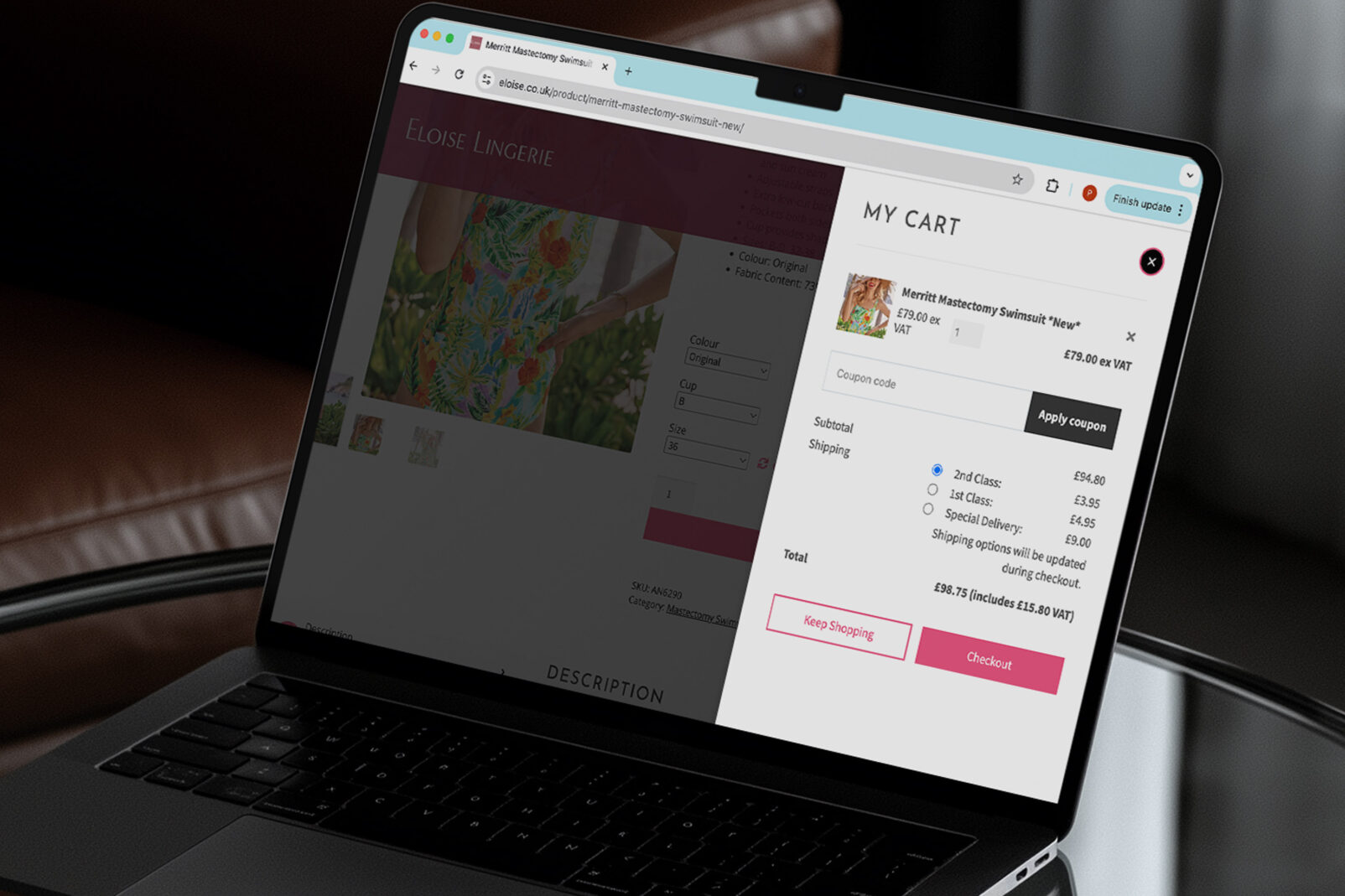
We introduced a streamlined mini cart and simplified checkout flow, designed to:
- Reduce the number of clicks between “Add to Cart” and “Complete Purchase”
- Minimise form fatigue with smarter input defaults and field grouping
- Keep the user visually engaged with a clear, elegant interface throughout
- Make mobile checkout easier — because that’s where most Eloise customers are browsing and buying
- The updated cart now gives shoppers more clarity and control without distractions, while the checkout process feels fast, familiar, and on-brand.
The result
While it’s early days, the feedback has been overwhelmingly positive — both from the Eloise team and their customers. The entire purchase process now feels like an extension of the brand: smooth, confident, and customer-focused.
Why this matters
Checkout UX is often overlooked in eCommerce design. Brands invest in product photography, SEO, and Instagram ads — but lose sales at the final hurdle due to small (but costly) friction points.
Our work with Eloise is a reminder that even subtle UX improvements can drive real business impact.
Want to improve your eCommerce experience?
Whether you need a full website redesign or a smarter, faster checkout, we’re here to help.
Get in touch with Design by Pre — and let’s make your website work harder.


Share this