
How to Make Brochures People Actually Read
In a world where attention spans are shorter than ever, a well-designed brochure still holds real power. Done right, it can make people stop, take notice, and remember what you have to say.
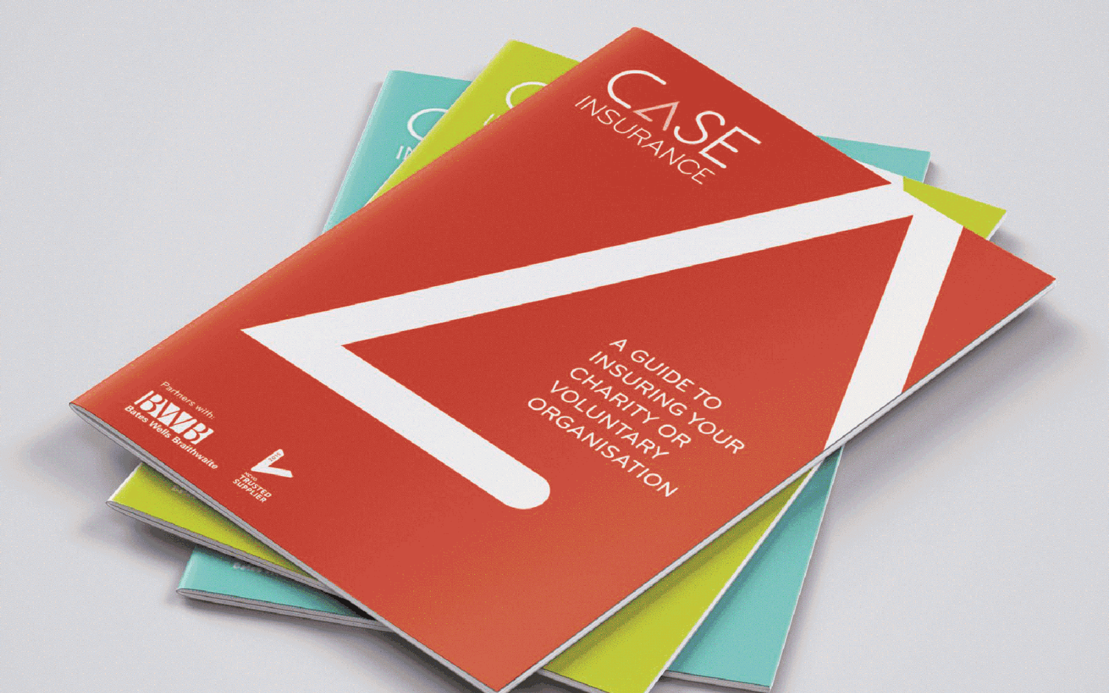
At PRE, we’ve designed brochures, annual reports, and marketing materials for clients across Surrey and beyond — and one thing we’ve learned is that a brochure’s success isn’t just about looking beautiful. It’s about how it feels, reads, and connects with the audience.
Here’s how we approach brochure design that people actually want to pick up — and more importantly, keep reading.
1. Start with the Reader, Not the Layout
The best brochures are written for people, not designers.
Before we think about grids or typefaces, we focus on who will be reading it and why. Are they looking for inspiration? Practical information? Reassurance? The answers shape everything — from content hierarchy to visual tone.
Understanding your audience means we can make sure your brochure speaks directly to them — using design that guides the eye naturally and tells a clear story.
2. Design for Clarity and Flow
Nobody enjoys a wall of text. A good brochure design should help readers move through information easily.
We use visual hierarchy — headings, pull quotes, imagery, and negative space — to keep readers engaged and comfortable.
Think of it as choreography: the design leads people’s eyes where they need to go next, creating a sense of rhythm and flow.
3. Keep Copy Tight, Purposeful, and Real
Good writing is just as important as good design. We often work with clients to refine their copy so every word earns its place.
The goal isn’t to say more — it’s to say what matters better. Short, confident sentences have impact; long, jargon-filled paragraphs don’t.
When visuals and words work together, your message lands harder and sticks longer.
4. Make It a Tactile Experience
There’s still something powerful about holding a brochure in your hands. The weight of the paper, the texture of the cover, the way it folds — all of these details affect how people feel about your brand.
That’s why we consider materials and finishes from the start, not as an afterthought. A printed brochure should feel like your brand — whether that means understated and elegant or bold and vibrant.
5. Always Design With Purpose
Every page should have intent. From sales brochures to annual reports, your design should drive understanding, engagement, or action.
When design, copy, and print all work together, a brochure can do what digital can’t: create a lasting impression.
Our Approach to Brochure Design at PRE
At PRE, we don’t do design for design’s sake. We create brochures and reports that enhance experiences — designs that are easy to understand, enjoyable to use, and compelling to read.
Whether you need a product brochure, sales toolkit, or annual report, we help you communicate clearly and creatively, from content to print.
If you’re looking for graphic design in Surrey that blends creativity with commercial impact, we’d love to chat.


Share this